Monday 29 April 2013
Thursday 4 April 2013
Read at once if convenient. If inconvenient, read all the same.
Hello, my lovelies, I need to ask a favour. If you could please look at the front and back cover first drafts below, and then fill out this survey for me?
http://www.surveymonkey.com/s/SCJN7V3
(The draft of the front cover isn't completely finished, it needs a couple more doodles and an image of the band).
Thank you!
http://www.surveymonkey.com/s/SCJN7V3
(The draft of the front cover isn't completely finished, it needs a couple more doodles and an image of the band).
Thank you!
Wednesday 3 April 2013
Opinion Poll Time.
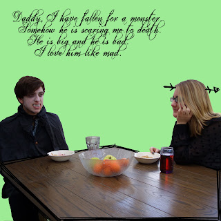
For the inside three slides on my digipak, I was thinking that I could put the lyrics in a doodly font and put them there, to keep in with the doodly theme and make it seem more personal.
Now, here is where I need help. I am uncertain as to whether to do the font in black or pink? The rest of the font in the album is pink, but that might be an eyesore. Also, I'm unsure whether or not to do all the lyrics and cover the page or just to put sections of lyrics on random places on the page?
I think I'm leaning more towards lyrics scattered, because a) I have to type out every single lyric to the song and then come up with lyrics to the songs I made up. I'd do that, in fact, I came up with some lyrics earlier for 'Dear Jimmy' in case I decided to do the whole lyrics thing (we also made up lyrics to Daisy but I think they're slightly inappropriate) and because b) it might be an eyesore having all the lyrics on it.
However, I will leave it to the voting public. For option a, call 0845 674 892 and for option b, call 0845 674 893. Calls are charged at standard network rate and calls from mobiles will cost considerably more. Lines close on 23rd May 2013, votes cast after this time will not be counted but may still be charged.
Edit: I asked Jess and she said she liked black font with the text everywhere and not just scattered. Thrilling stuff.
Fonts and Colours.
This post is more for me than anything, but here are the fonts I've been using and the colours that I've been using. This way, I can just come here for reference and won't have to guess.
The Machine Ate Florence: Suckerpunch (fontmeme.com)
Monsters/track listing: Frankenweenie (fontmeme.com)
Lyrics: Fmiring-Campotype-One (fontmeme.com - grafitti section)
Background colour: #91f683 (pale green)
Pink: #e856e8
The Machine Ate Florence: Suckerpunch (fontmeme.com)
Monsters/track listing: Frankenweenie (fontmeme.com)
Lyrics: Fmiring-Campotype-One (fontmeme.com - grafitti section)
Background colour: #91f683 (pale green)
Pink: #e856e8
Digipak Front & Back Cover Initial Drafts
Hello. Here are the initial drafts (minus the photography on the front cover of the 'band') of my front and back cover for my digipak. I decided to have the doodles on the front cover because, as I have discovered through analysis of music videos and digipaks, bands like to include something that makes it seem personal (eg. a 'backstage tour' music video) and I thought the doodles would establish this. Plus I like to doodle. I think I need to add more doodles, such as fire on the buildings, to suit the title of the album. Many thanks to fontmeme.com for providing me with fonts.
The kind soul on the back cover is our friend, Ben. He agreed to dress up as Frankenstein's Monster for me. This wasn't meant to be an actual shot, but I found it so hilarious I took a picture of it and then it actually ended up on the digipak. The picture suits the overall theme of monsters in normality, as it features Ben in an everyday situation whilst dressed as Frankenstein's Monster. I included a barcode and institution information to make it look official, and made up logos for the companies for this reason as well.
Can you guess where I got the titles for the songs from? English Lit 4 lyf.
Subscribe to:
Posts (Atom)


