Overexposed is Maroon 5's fourth studio album, which was released in June, 2012. Here is how they've marketed it and its singles:

This is what you see when you first go onto Maroon 5's website; it's there before you even enter the actual site. This draws attention to the fact that they have a new single out, and also encourages the user to buy it. This would be extremely useful for Maroon 5 fans who want to buy the album/song, because they wouldn't have to hunt them down. Because of the link to buy the song/album, it discourages illegal downloading, most of which occurs because it's effort to find the track.

The Twitter page for Maroon 5 features the same image as the home page, creating consistency across the marketing campaign. This consistency makes the campaign recognisable, as it is more likely that the audience will remember it if they have seen it many times in different places.
The actual tweets also promote not only the album and the song, but other promotional events that are occurring, such as Adam Levine's appearance on Saturday Night Live. This encourages the audience to watch even more promotion for the album and song, and therefore making it more likely that they will make a purchase.

This is on the homepage of Maroon5.com. As you can see, it is consistent with the other two campaigns. Maroon 5 fans will be likely to check their Twitter and their homepage, so this bombardment of advertisement encourages sales from the target audience.
The text used in the marketing campaign is bright and doodle-y. This matches the album cover.
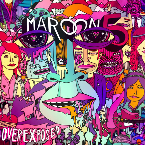
The album cover is bright, it's doodle-y and it stands out. It's very different from Maroon 5's past two albums:


However, the style of artwork is somewhat similar to the band's first album, Songs About Jane:

It Won't Be Soon Before Long and Hands All Over did not receive great commercial success; however, Songs About Jane did. A return to similar artwork could suggest to fans that the band is returning to the Songs About Jane era in style (which they're not, but they might want to give that impression). It also links, for people aren't fans, this album to the first album. People who aren't die hard fans probably would have missed the 2nd and 3rd album, but they probably have heard at least one Songs About Jane single, so linking the new album to the first allows for new listeners.
The bright colours also signify a change from quite downbeat songs to upbeat, more pop-style songs. It also makes the album stand out on a shelf, so it is more likely that a person would see it and want to buy it. More importantly, this image would stand out as a thumbnail on iTunes, making the potential listener think about clicking on that one instead of another, because it's bolder and more noticeable. The brightness also appeals to the target audience, who are generally young people, and young people enjoy quirky things.
Other promotional activities included:
- an interview with The Sun: http://www.thesun.co.uk/sol/homepage/showbiz/sftw/4401007/Maroon-5-frontman-Adam-Levine-It-used-to-be-uncool-to-like-us-but-now-its-OK.html
- Adam Levine hosting SNL.
- Adam Levine being in American Horror Story (not a direct promotion, but it still works. People who watch AHS generally are the same target audience for Maroon 5 albums).
Most marketing outside the Twitter and homepage revolve around Adam Levine, not the rest of the band. Normally, I'd think that's a pretty low thing to do to the rest of the band, but look:

He clearly deserves lots of attention.
No comments:
Post a Comment